2. Core Concepts
Projects, Pages, and Widgets Intro (프로젝트, 페이지, 위젯 소개)
Project
- A self-contained app — all the files that make up your application, organized under the assets folder (pages, scripts, providers, theme, etc.). When you create a new project, these files are created automatically.
- To learn more about how to create and manage projects, visit Manage Projects in Lucy Team Cloud.
Page
- A Page is one screen of your app, and the unit you navigate between — think of it as the navigation layer.
- Inside each Page sits a Form, which holds the live, interactive content — the interactive layer.
- The Form holds the page's widget tree, its script, and its data.
- Note: the Form referred to here is different from the FormContainer widget — the FormContainer widget lets you embed one Form inside another.
- To learn more about how to create and manage pages, visit Layout and Screen Design.
Widget
- A widget is a visual building block placed inside a form.
Layout Concepts (레이아웃 개념)
- Layout widgets are the fundamental building blocks of a design in Lucy Studio. They give your page its structure and let you align the widgets inside of it. Although all the layout widgets are grouped into one section in Lucy Studio, we can think of them in three separate groups — Basic, List, and Area.
- Below is a brief introduction of these widgets. To learn more about individual layout widgets, their properties, and in-depth layout concepts, visit Layout and Screen Design and Work with Widgets.
Basic Layout Widgets
Layout widgets hold other widgets inside them. A widget placed inside a layout is its child; the layout is that child's parent (one level up). Widgets sharing the same parent are siblings (same level). This parent → child → sibling structure is called the widget tree.
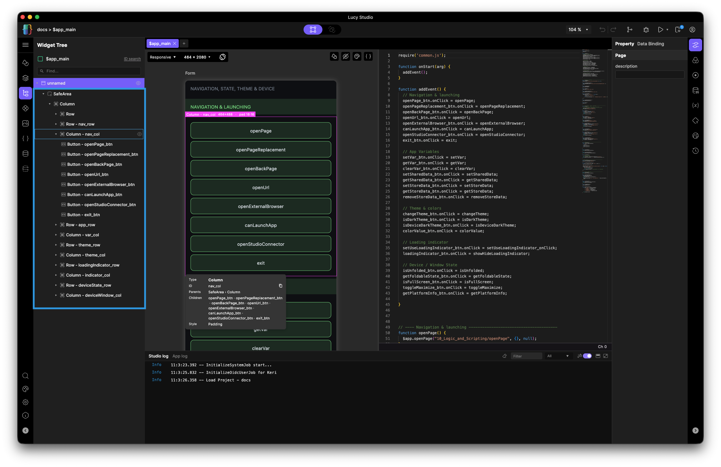
-
Column vs Row:
- Column: Positions its children from top to bottom
- Row: Positions its children from left to right

-
Stack: Lays the children on top of each other (you can think of it like a stack of pancakes)

-
Wrap: Lays out children in a line, and when they run out of room, the extra ones wrap onto the next line.

-
Main-Axis vs Cross-Axis:
- Column — since a Column positions its children from top to bottom, its main-axis runs vertically and its cross-axis runs horizontally.

- Row — since a Row positions its children from left to right, its main-axis runs horizontally and its cross-axis runs vertically.

List Layout Widgets
- ListView: 1D scrolling list
- GridView: 2D grid layout
- MasonryGrid: Uneven-height cards in fixed columns
Area Layout Widgets
- SafeArea: Adds automatic padding to avoid overlap with notch, navigation bar, and home indicator on mobile devices
- Card: Material-style card container for grouped content
- PageView: Scrolls one full page at a time
- VSplit: Splits the page area vertically
- HSplit: Splits the page area horizontally
Applying Style to Widgets
Every widget can be wrapped by interior decorators called widget styles. Unlike layout widgets which hold other widgets, widget styles wrap a single widget to modify how it looks or behaves — without changing the widget tree structure around it. You can stack multiple styles on the same widget, and they apply in order from the outermost inward.
To learn more about how to apply and use these styles, visit: Styles
Design System & Components (디자인 시스템 & 컴포넌트)
Design System
Lucy's design system is the set of reusable styles you manage in the Styles dialog — Text Styles, Color Themes, and Icon Sets. Define them once and apply them across the app; change a definition and every use updates automatically. This ensures every screen looks coherent.
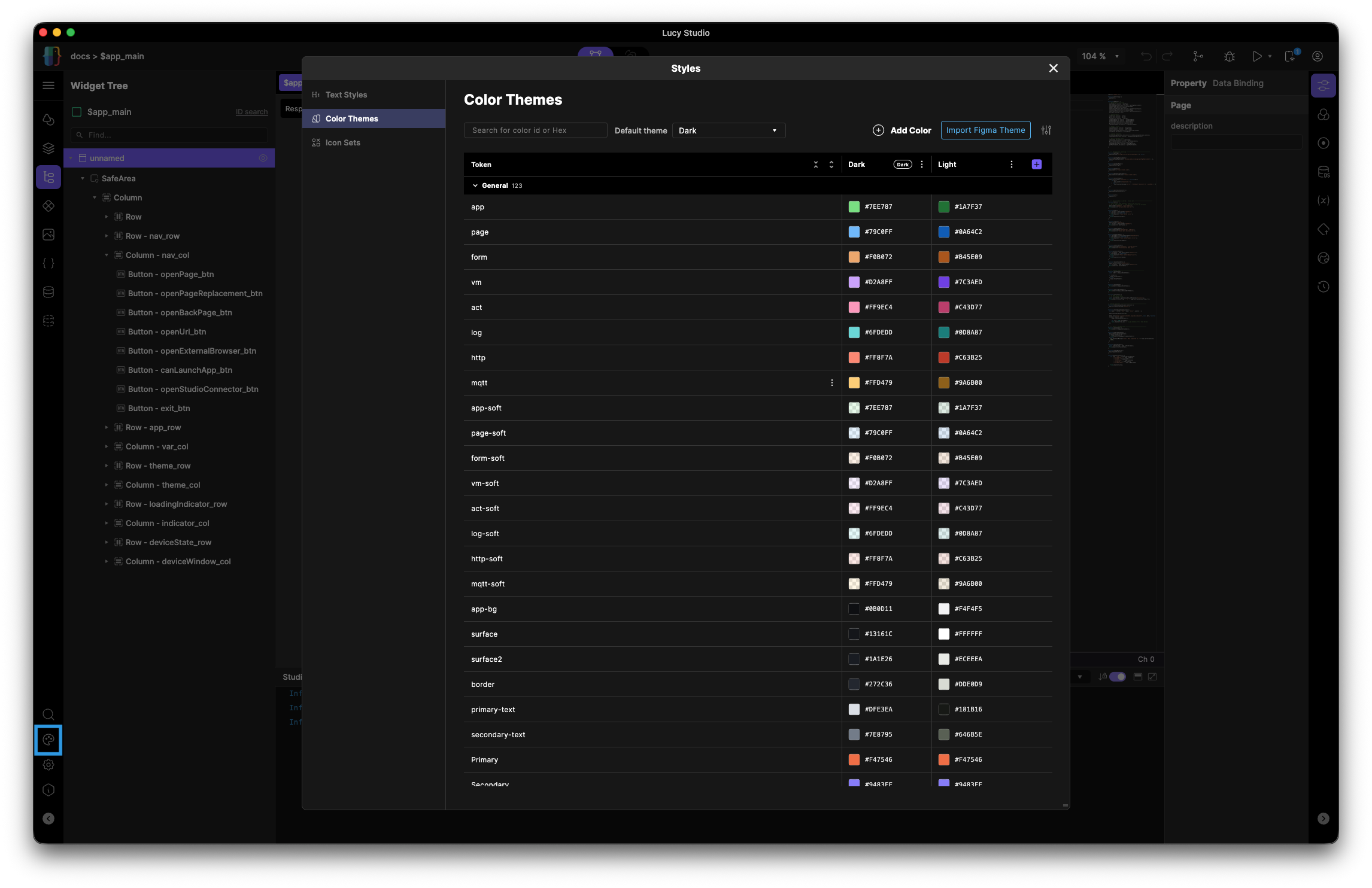
- Text Styles: named, reusable typography.
- Color Themes: named colors, with light/dark theme variants. Color themes are theme-aware, so a color can carry distinct light/dark values, and the app can switch themes at runtime (
$app.changeTheme). - Icon Sets: reusable icon collections.
Components
A component in Lucy Studio is a widget group you build once and can reuse throughout the app. Changing the master updates its instances throughout the app. To learn more in-depth about how to use components in Lucy Studio, visit Work with Widgets.
- Component vs. page — a page is a navigable screen; a component is a reusable piece embedded inside pages.
- Master vs. instance — one master definition; each place you use it is an instance that can override its own values (per-instance properties, variables).
Data Binding
Data Binding is a way of deciding in advance where a widget property's value comes from. When you pick a property in the widget's Properties panel, you can connect it to a predefined Data Set that already holds a value.
Once connected, Lucy Studio automatically keeps the widget up to date whenever the connected source changes. This is where it differs from setting a value directly via script
— a script pushes a value only once, at that moment, while a binding keeps watching the source and reacts every time it changes.
For details on each connection target, see Data and State Management.
Script
Lucy Studio combines standard JavaScript with platform APIs so you can implement complex logic and dynamic behavior.
For example, you can react to user events in real time, change widget properties dynamically at runtime, request data from a server and reflect it on screen, or control the app's flow, such as navigating between pages.
Widgets placed on the screen are automatically registered as script global objects, so you can reference a widget by its ID directly in a script (e.g. button1.visible = false).
For details on how to write scripts and the global objects/functions available, see Logic and Scripting.
Animation Mode
Animation Mode is a NoCode Logic Tool that lets you set up a widget's behavior conditions and execution logic right on the screen, without writing code.
Just by selecting and connecting conditions and reactions in the UI, you can build complex interactions, making it quick and intuitive to create logic without scripting. It's made up of three main features.
- Detect Transition Watches for changes in a variable's or widget property's value, and automatically runs a registered reaction once the condition you set is met.
- State Transition Sets up the animation effect that plays when a widget changes to a different state. (e.g., a button's color fading to a new color)
- Action Sets up the logic to run in response to a specific user action (event). (e.g., navigating to a page when a button is tapped) You can run multiple actions sequentially or in parallel, and control whether they run based on a condition.
For details, see the Studio Interface section.
Workflow: Build in Studio, Preview in Player (워크플로우: 스튜디오에서 제작, 플레이어에서 미리보기)
What Lucy Player Is
Lucy Player lets you test your designs made in Lucy Studio in real-time. It runs on iOS, Android, Windows and macOS, so you can preview your screens on a real device.
How Studio & Player Connect
There are a few ways a connection is established between Lucy Player and Lucy Studio, depending on your setup:
- When connected to the same network, Lucy Studio will find Lucy Player automatically.
- When run on the same computer, Lucy Player will be detected and connected immediately.
- When connected to different networks (for instance, if you are using cellular data), you must scan the QR code created by Lucy Studio.
Live Preview
After editing a page in the canvas, you can view your edits right away on a real device, seeing exactly how your design will look. All you have to do is connect with Lucy Player, choose the device you want to send the screen to, and press the play button in Lucy Studio's Action bar. For more detailed steps on how to set up Lucy Player and connect it with Lucy Studio, visit Test and Debug.