Panel
Panel sits on the right side of the screen, letting you edit the detailed properties and behavior of the currently selected widget in real time.
You can intuitively set and adjust properties like color, font, size, animation, events, and data binding for the widget you selected in Canvas.
What you can configure in Panel changes depending on the mode you're working in (Design Mode / Animation Mode).
| Design Mode | Animation Mode | |
|---|---|---|
| Main goal | Define the app's functionality, structure, and data integration | Define the app's interactions and visual effects |
| Key tabs | Property, Style, Data Set, Provider Instance, Variable | Action, Detect Transition, State Transition |
| Core role | Set what a widget shows and what data it uses | Set what happens to a widget, and how it moves, in response |
Panel Features in Design Mode
Design Mode is the default mode for developing your app's functionality and structure — UI layout, data integration, variable management, and more.
In this mode, Panel has 8 tabs: Property, Style, State, Data Set, Variables, Provider Instance, i18n, and Local History.
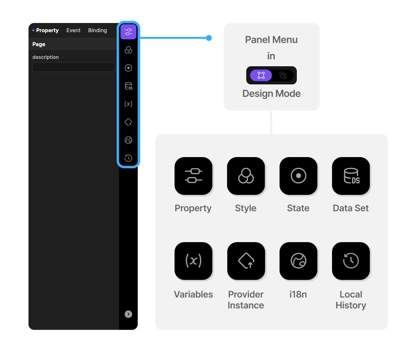
1. Property Tab
Sets the basic functionality and behavior of the selected widget.
- Basic properties: Set the widget's own properties, such as its name, visibility, position control, and alignment.
- Widget-specific settings: Depending on the type of widget selected — Page, Form, Row, Image, and others — set properties specific to that type, such as page creation, data binding, and layout alignment.
2. Style Tab
Sets the widget's visual design elements.
- Background and outline: Set the background color, border, corner radius, and box shadow.
- Transform: Adjust the widget's size, rotation, position, and more with the Transform feature.
- Gesture Detector: Set up events that respond to user touch gestures on the widget, like tap and drag.
- DecoratedBox: Apply Box Decoration to the widget to build more complex background designs.
3. Data Set Tab
Sets the structure and definition of the data you'll bind to the widget.
How Data Set and Provider Instance relate
A Data Set is a structured data container for binding to the UI; a Provider Instance handles calling external data.
- Create a Data Set: Create a custom Data Set and define the items (Group/Item) and structure of the data you'll use.
- Connect a Provider Instance: Connect to an already-defined Provider Instance to pull in a data structure and define it in a Data Set.
- Data binding: Use a Contents Data Set to connect (bind) data to a widget.
4. Provider Instance Tab
Defines and configures communication with an external data source (API), managing the logic for sending and receiving data with a server.
- Create an instance: Search for and select the data provider you want to use, then create an instance.
- Configure the Call tab: Set the parameters needed for the API call, and connect (bind) them to constant values or to another widget's property values.
- Configure the Response tab: Define the response data structure returned by the API call, and map only the data you need for use.
5. Variable Tab
Creates and manages variables for temporarily storing and manipulating data within the app.
- Variable types: Create a Page Variable, valid across the whole page, or a Form Variable, valid within a Form.
- Composite variables: Create a Simple variable, or a Complex variable that holds multiple items.
- Grid Variable: Create and manage variables used with Grid-type widgets.
6. State Tab
Lets a widget show different property values depending on its state — hover, pressed, focused, disabled, selected, and more. (For example, a button's background color is blue by default and light blue on hover.)
- Registering states: Beyond states like hover/pressed/focused, which are detected automatically from mouse entry and clicks, you can add disabled/selected or your own custom states. You toggle custom states directly via script or binding.
- Property overrides: Specify which properties and values change for each state.
- Transition duration: Instead of changing instantly the moment a state changes, set a duration (in ms) so the value transitions smoothly.
- Propagate to children: Choose whether to apply the same state to child widgets as well.
7. i18n Tab
Manages translatable text and other strings on the widget, by language.
This tab is locked on the Free plan and available on the Pro and Enterprise plans.
- Auto Translate: Click Auto Translate to automatically translate all matched text at once.
- Your project's supported languages, default language, and auto-translation service are managed separately in the project settings.
8. Local History Tab
A local-only safety net that automatically records your work at set intervals. If you lose work because you forgot to save, you can roll back to an earlier point.
- Auto Save: While you're editing, the current state is recorded automatically at a set interval (30 seconds by default, adjustable from 10 seconds to 5 minutes in settings).
- Manual Save: Save manually at any point, with a comment describing the change.
- Milestone: Mark important saved versions as milestones to protect them from being cleaned up over time.
- Compare: Select two points from the list to see what changed between them.
- Restore: Roll back to a previous state — either everything, or just the parts you choose (scripts, screen layout, variables, and so on). Your current state is backed up automatically before restoring.
Local History is stored locally on your PC only. Moving your project to another computer or sharing it with teammates does not carry the history over with it.
Panel Features in Animation Mode
Animation Mode is where you set up animations and interactions between widgets and pages.
In this mode, Panel has 3 tabs: Action, Detect Transition, and State Transition.
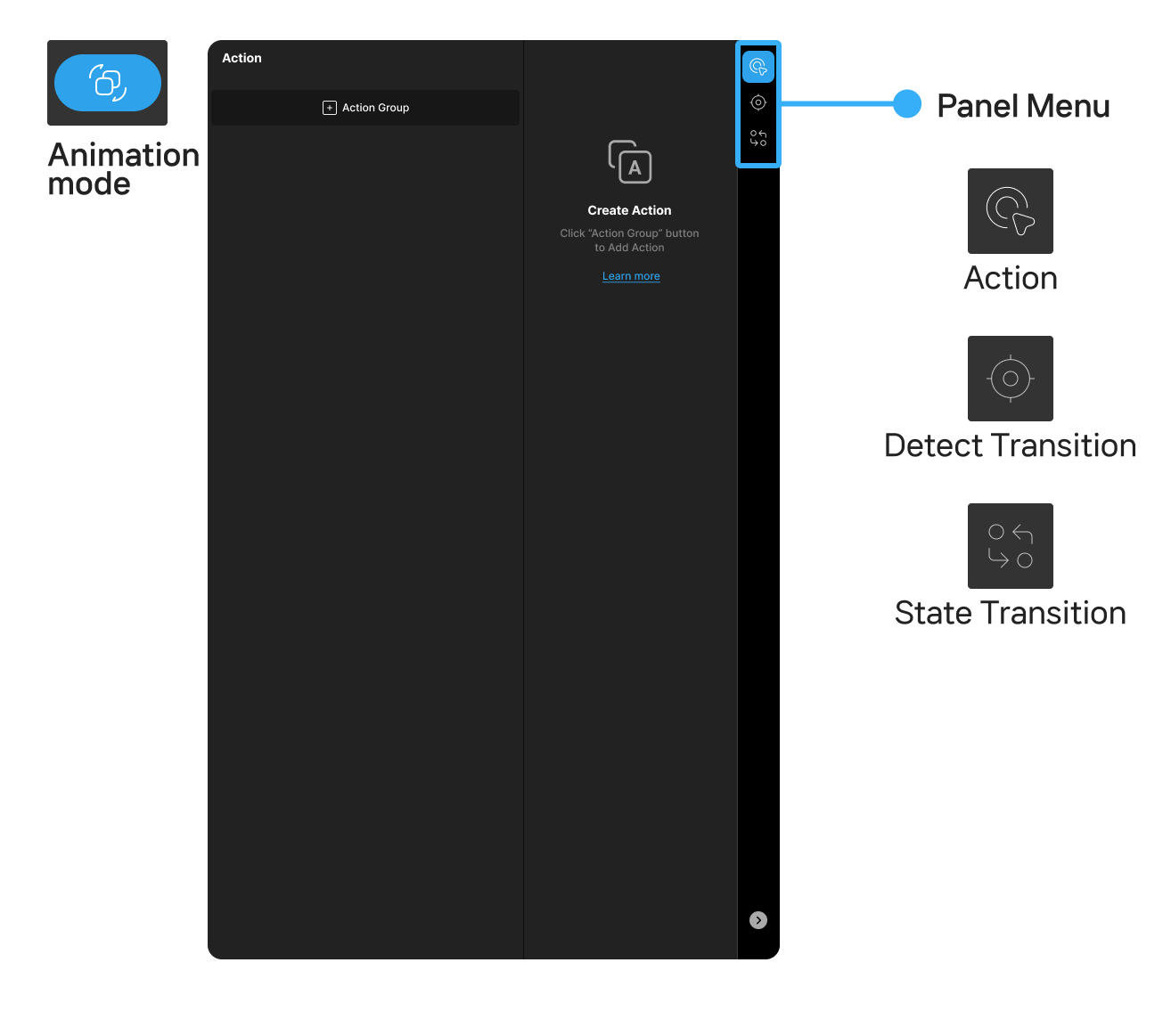
1. Action Tab
Sets up logic to run in response to a specific user action. (For example, navigating to a page when a button is tapped.)
- Define events: Choose an event the widget triggers, and specify the action to run when it occurs.
- Sequential execution: Run multiple actions in parallel or in sequence, so you can build your workflow however you need.
- Conditions: Set an action to run only when a specific condition is met, so you can build more complex logic.
2. Detect Transition Tab
Watches for changes in a variable's or a control's property value in Lucy Studio, and automatically runs a registered Event Response once the condition you set is met.
- Optimized for detecting real-time state changes and running events automatically.
- Register and edit the conditions and reactions you want with simple UI operations.
3. State Transition Tab
Sets up the subtle animation effects that play when a widget changes to a different state. (For example, a button's color changing.)
- Transition types: There are four types — Layout, Action, Condition, and Link.
- Layout: Changes the numeric value of a property — including style properties — on a widget over an interval.
- Action: Runs an action.
- Condition: Runs the transition group if the condition is true.
- Link: Runs the linked transition group.
This is different from State in Design Mode (Tab 6).
State Transition is a timeline animation that plays when a specific trigger fires, while State switches properties based on whether a widget is currently in that state or not.