5. Layout and Screen Design
Create and Manage Pages (페이지 생성 및 관리)
Each Page is a visual canvas onto which widgets are placed via drag-and-drop.
Create a Page
There are three ways you can create a page in Lucy Studio.
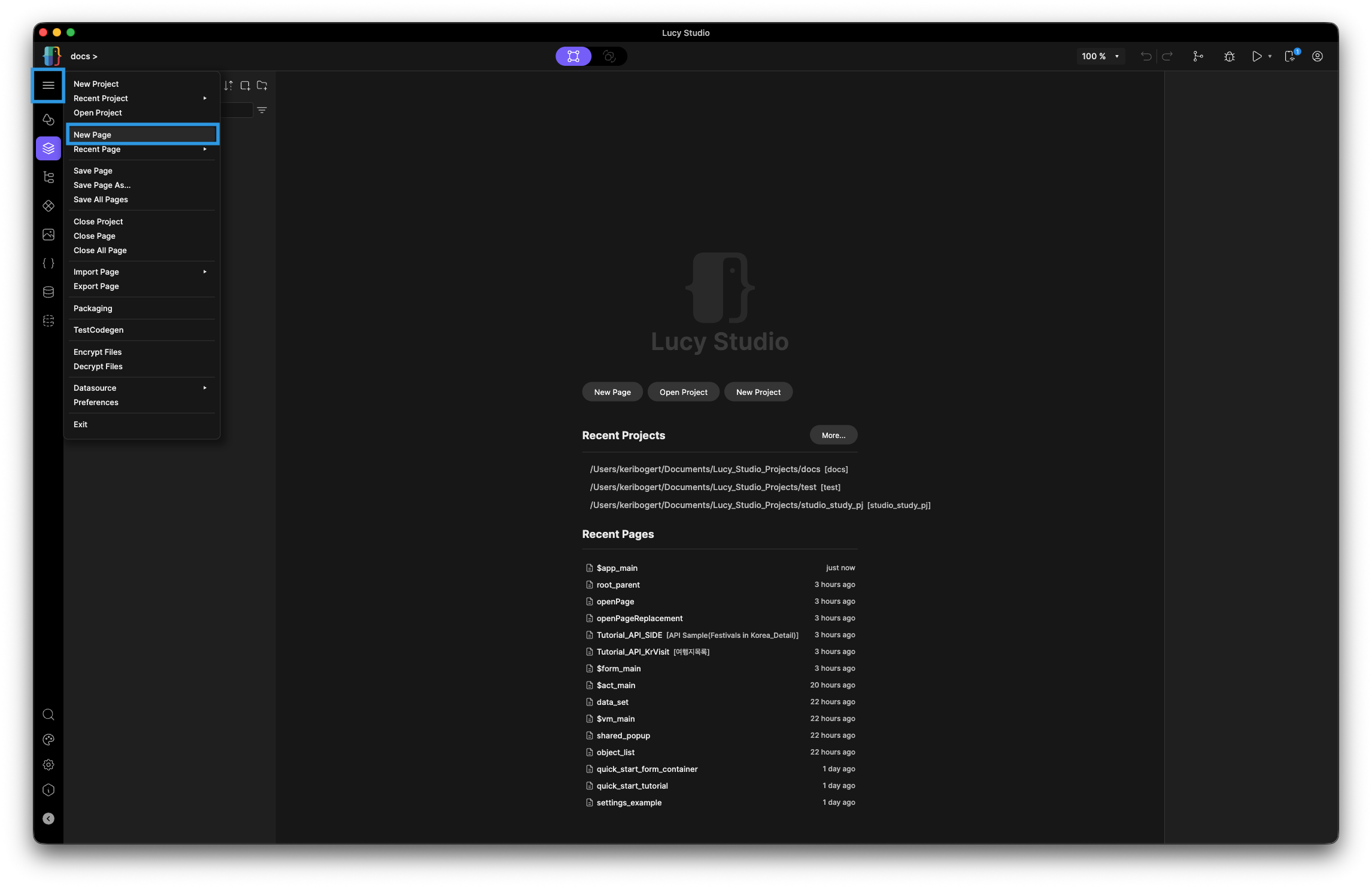
- Hamburger Menu
-
Go to the Hamburger Menu
-
Click on 'New Page'
-
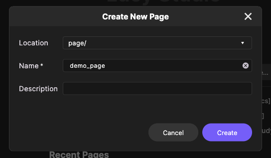
Fill in the 'Name' field in the 'Create New Page' dialog (description is optional)
-
- Visit the Page Tab
-
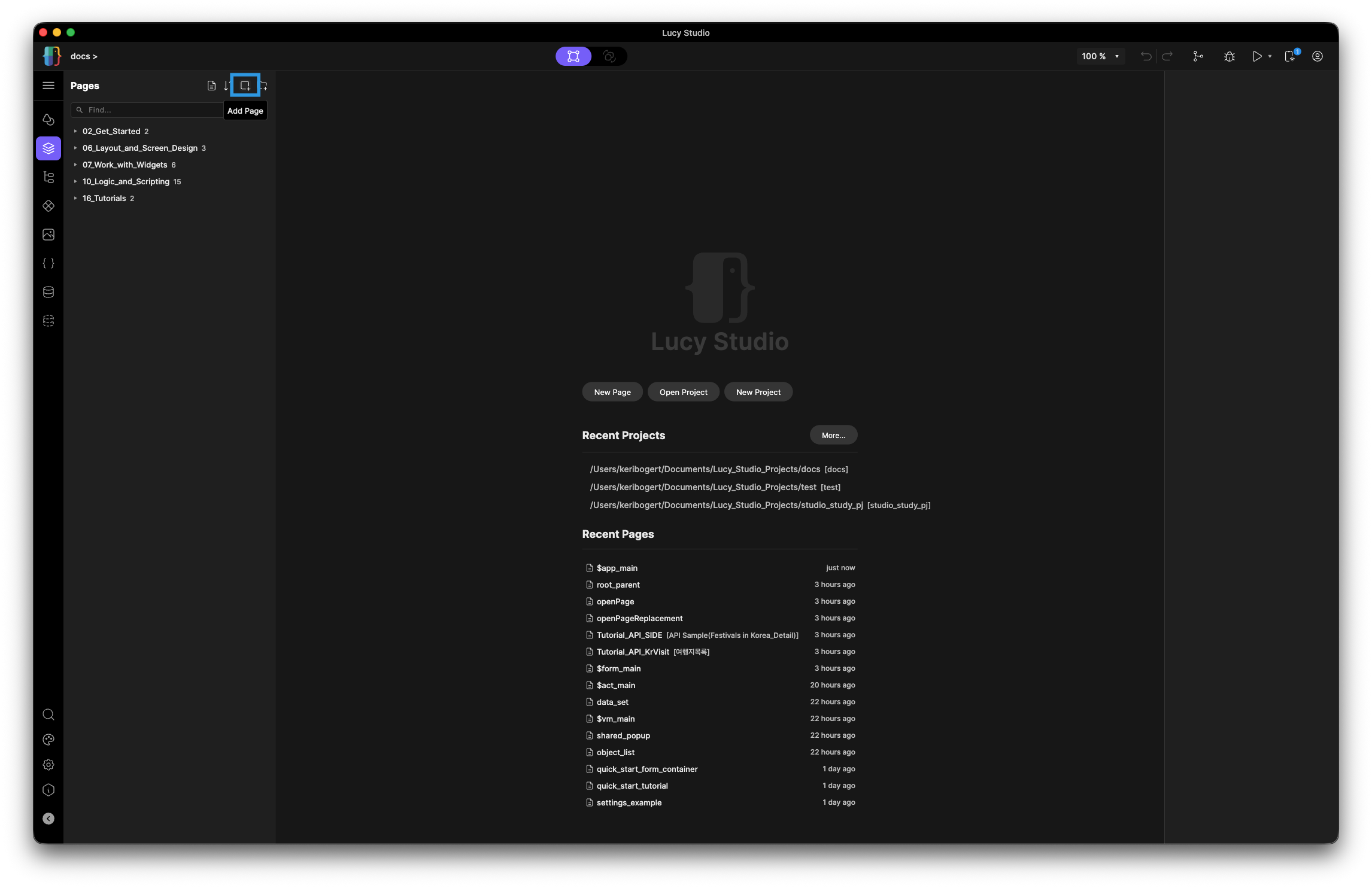
Go to the Page Tab (third icon in the Plate menu)
-
Click the 'add new page' icon at the top
-
Fill in the 'Name' field in the 'Create New Page' dialog (description is optional)
-
Manage Pages - Delete, Rename, Duplicate
To organize your pages into larger categories, you can create a folder. The below contents will also show you how to delete, rename, and duplicate a page.
-
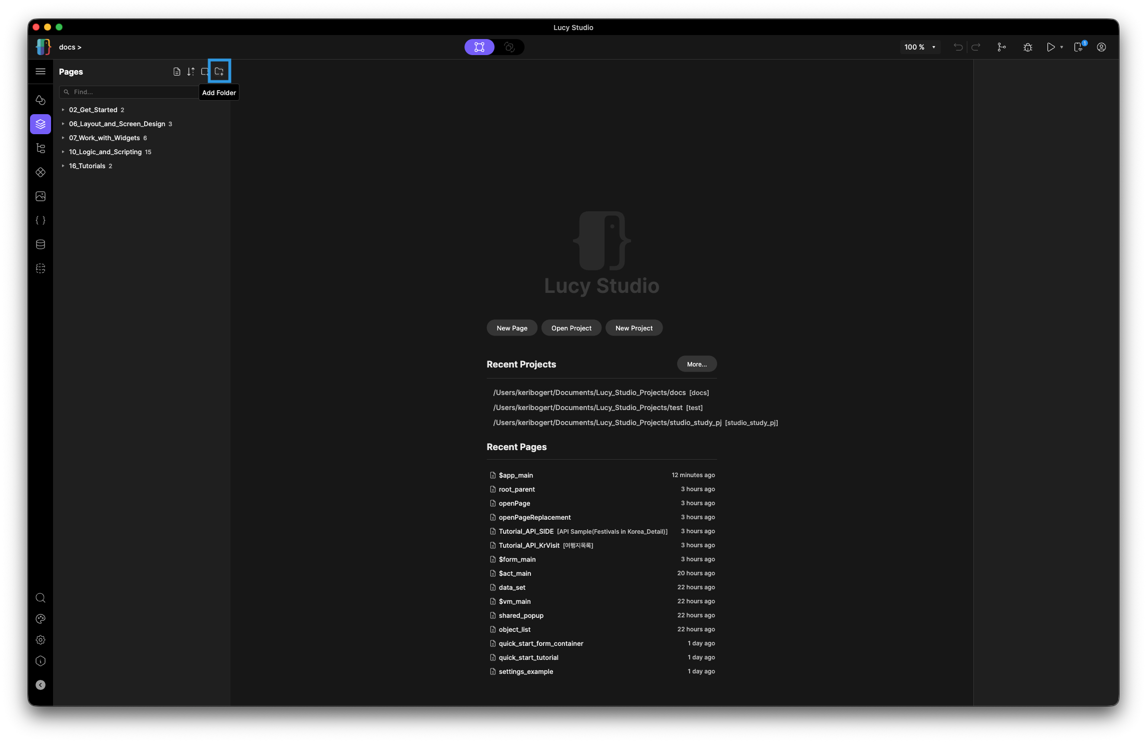
Create a folder
-
Click the 'plus folder icon'
-
Fill in the 'Folder Name' and 'Description'
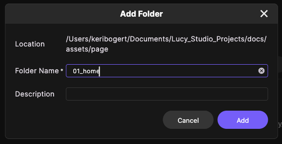
noteCurrently, dragging and dropping a page into a folder is not supported. Right-click on a folder to directly add a page.
-
-
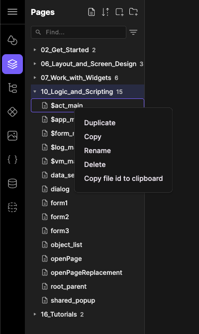
Delete, Rename, or Duplicate a page
-
Right-click on the page you want to delete, rename, or duplicate.
-
Page Size / Device Type
At the top of the canvas area, you will see a 'Device Type' dropdown. Here you can choose what device you want to build for. The size of the canvas will match the size of the device, so you can design exactly for your desired device.
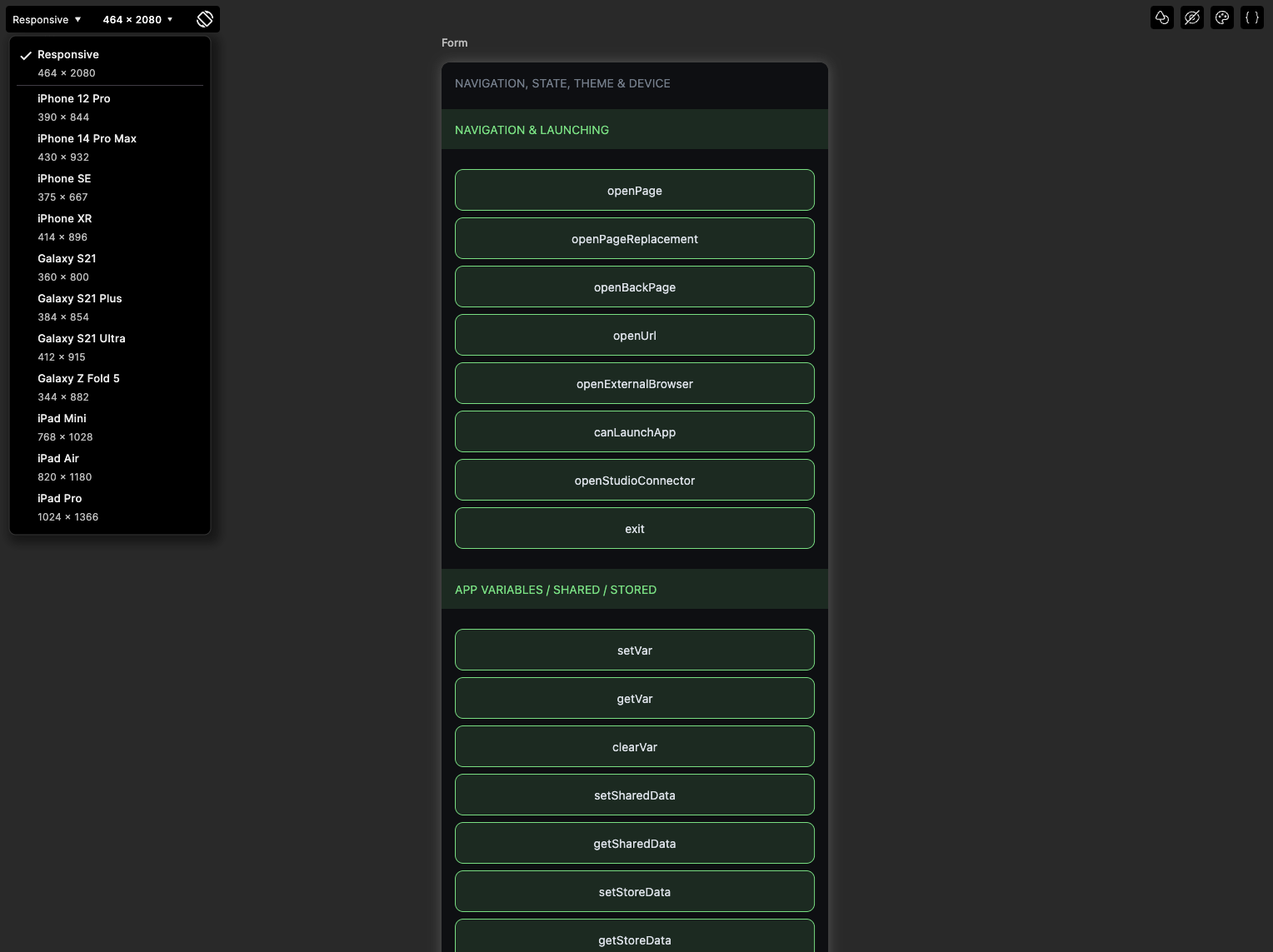
- Responsive - the canvas does not lock to any specific device's dimensions. Instead, it previews at a default size of 1024×768 and the layout is designed to adapt to whatever screen size runs the app at runtime. Use Responsive mode when targeting web or desktop where screen sizes vary widely.
- Foldable Device - the canvas has two states: folded (344×882) and unfolded (690×829). You can toggle between the two states in the Studio to design for each layout. When building for foldable devices, you need to design and test both the folded and unfolded views.
Page Properties
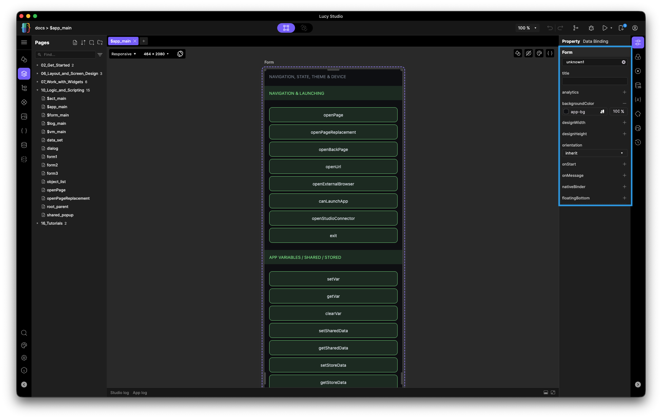
Clicking on a page in the canvas area will display its properties that can be set. Some of these properties include the page's background color, design height, design width, and so on.
Use Layout Widgets (레이아웃 위젯 사용)
Each page can only have one parent widget. This parent widget is usually a Column or a Row.
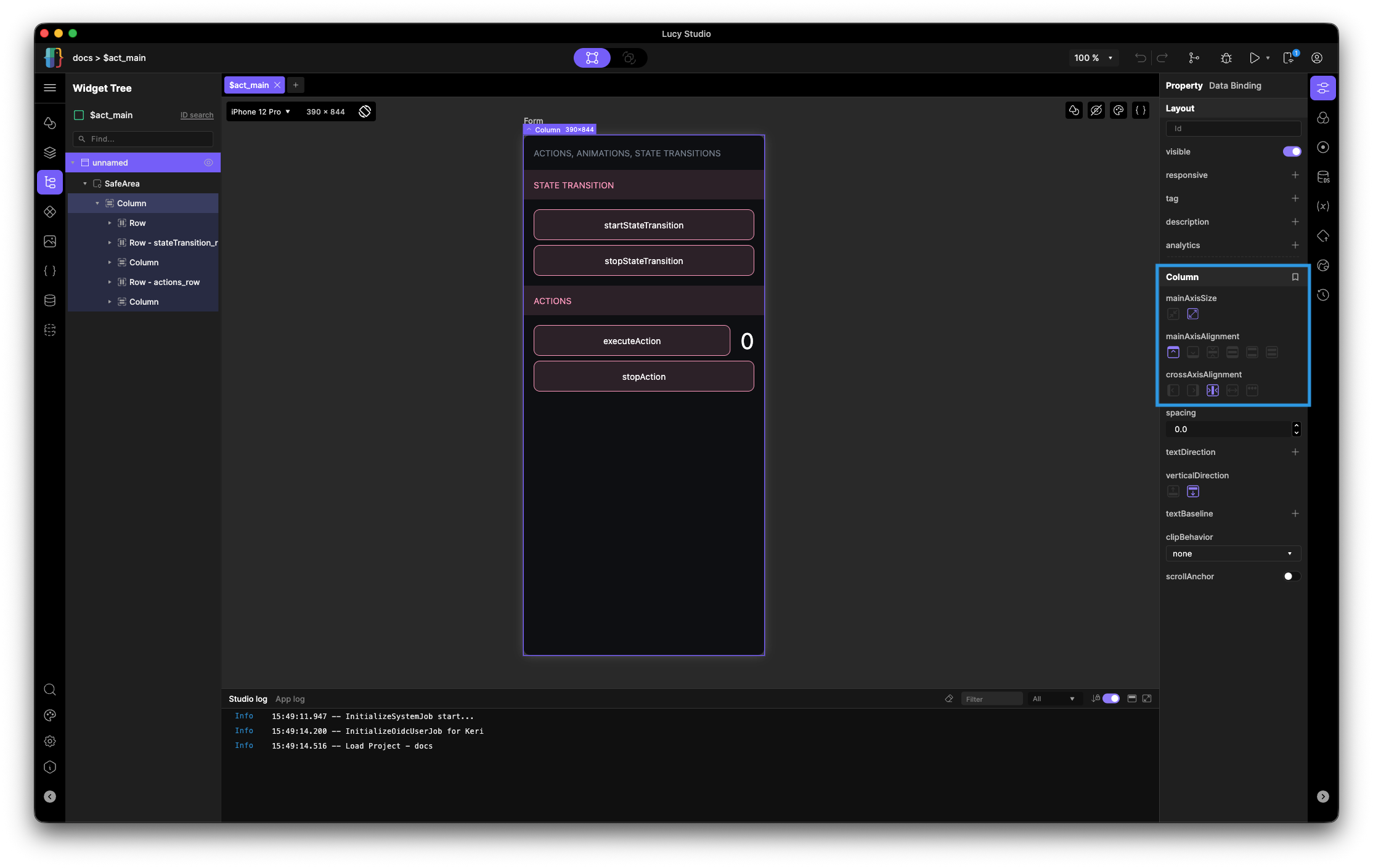
- Column
-
Positions children top to bottom
-
MainAxisSize
- min: Uses the sum of the child heights
- max: Uses the maximum height allowed by the parent (default)
-
MainAxisAlignment - aligns the column's children from top to bottom

-
CrossAxisAlignment - aligns the column's children from left to right

-
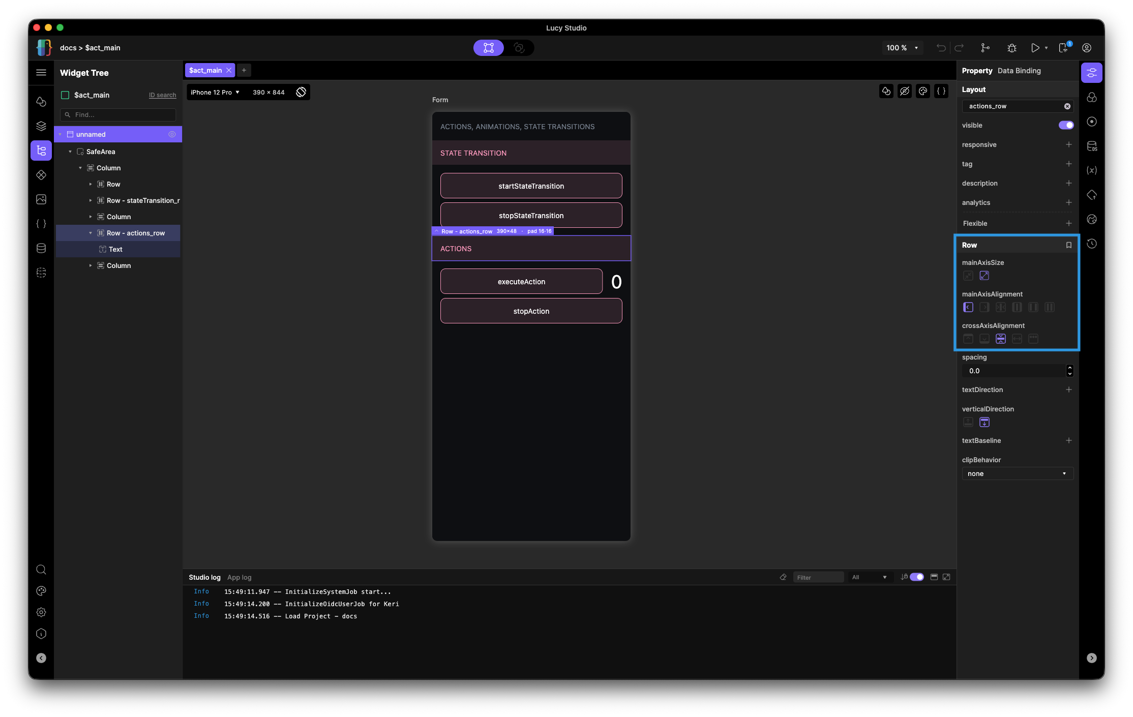
- Row
-
Positions children left to right
-
MainAxisSize
- min: Uses the sum of the child width
- max: Uses the maximum width allowed by the parent (default)
-
MainAxisAlignment - aligns the row's children from left to right

-
CrossAxisAlignment - aligns the row's children from top to bottom

-
There are cases where the parent widget can be something other than a Row or Column. These widgets can be found under the 'Layout' section.
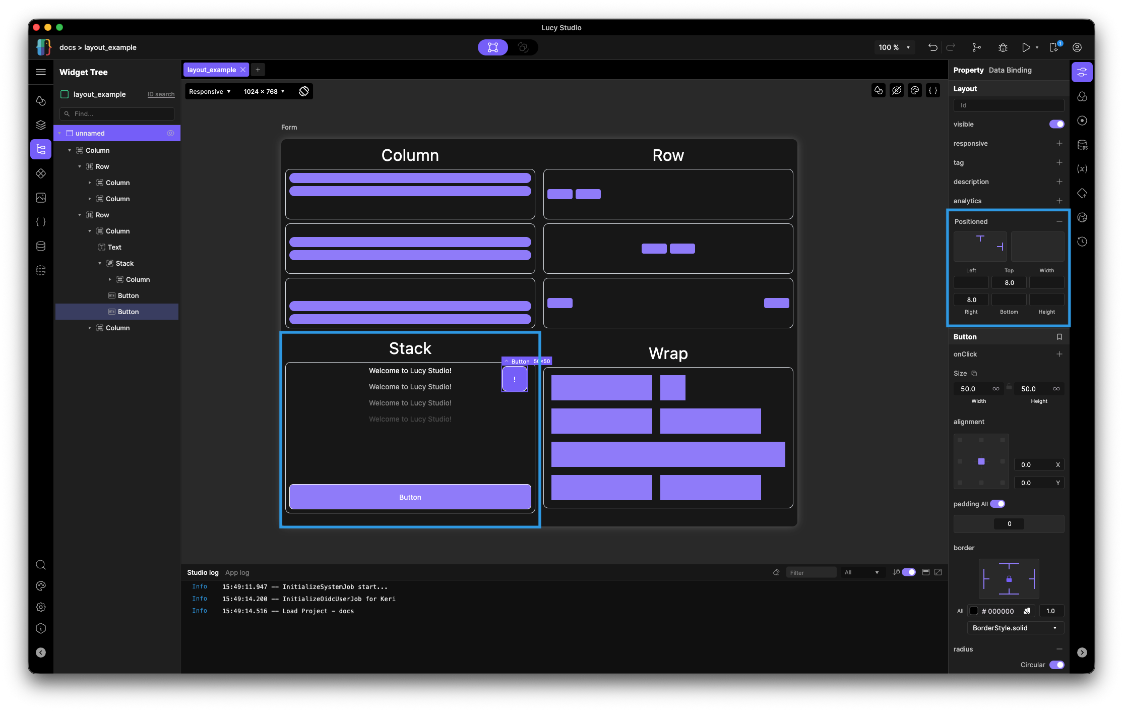
- Stack
-
Stack lays all children on top of each other at the same position. By default children are positioned at the top-left corner of the stack, but each child can be given an absolute position within the stack using the 'Positioned' property.
-
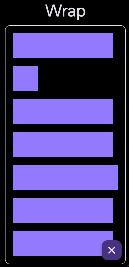
- Wrap
-
Wraps children into rows (or columns, if the axis is set to vertical). When the next child would exceed the available width, it moves to a new line. Unlike a Column, Wrap does not require children to fill the full width — each child takes only the space it needs.
-
Supplemental Layout Widgets
In Lucy Studio, these widgets are under the 'Dividers' section, but they help in creating your desired layout.
-
Spacer: The Spacer widget is invisible, but it is a widget that fills all the remaining space along the main axis of its parent Row or Column. It is most commonly used to push siblings to opposite ends. Use a Spacer when you want the gap to adapt to available space.

-
Divider-H: Horizontal dividing line
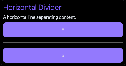
-
Divider-V: Vertical dividing line
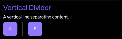
-
SpaceBox: The SpaceBox widget is a fixed-size empty box used to insert a precise gap between widgets. Use a SpaceBox when you need a specific, unchanging distance.

If you need space around a specific widget, apply Padding as a style property to that widget — this keeps the tree more compact than adding a SpaceBox. If you need a widget to grow and fill remaining space, apply the Flexible property to it rather than adding a separate Spacer. Use Spacer or SpaceBox when you need a gap between two sibling widgets that you cannot otherwise modify.
List and Area Layout Patterns (리스트 및 영역 레이아웃 패턴)
These recipes show how to combine layout widgets to achieve common screen structures. The individual widget properties are covered in the widget reference section. You can visit Work with Widgets to find more about these properties.
-
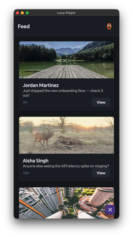
Feed (06_Layout_and_Screen_Design > feed_example) — a scrollable feed built by placing Card widgets inside a ListView. Each Card holds one item's content (e.g. an image, title, and description), and the ListView stacks them vertically and handles the scrolling. This pattern works well for content feeds, product listings, or any screen that needs a repeating, scrollable list of items.
-
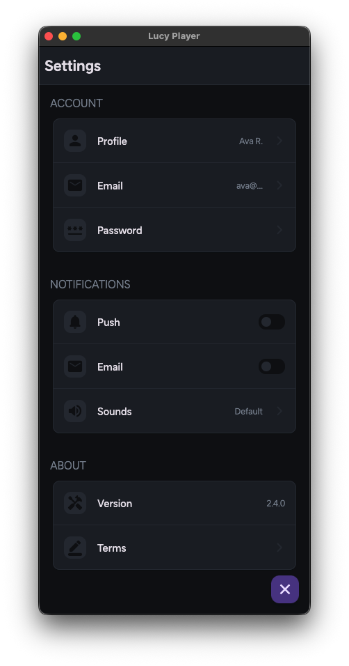
Settings (06_Layout_and_Screen_Design > settings_example) — a settings screen built from Column, Row, and Card widgets. Since the Cards vary in layout and content from section to section, this pattern doesn't use a ListView; instead, each section is arranged individually with Columns and Rows. This approach works well when a settings or preferences screen needs each section to have its own custom layout rather than repeating a uniform row template.
Build Responsive Layouts (반응형 레이아웃 만들기)
Applying the 'Flexible' property to widgets will help you achieve a responsive layout. Every widget comes with the option to apply the 'Flexible' property IF the parent is a Row or Column.
Applying Flexible to Widgets
- To apply the Flexible property, click on the widget you want to apply the property to and visit the 'Property' tab.
- You will see a flex and fit property
-
Flex: Each child will expand and fill the space that their flex value divided by the sum of all the children's flex values (including its own) equals.

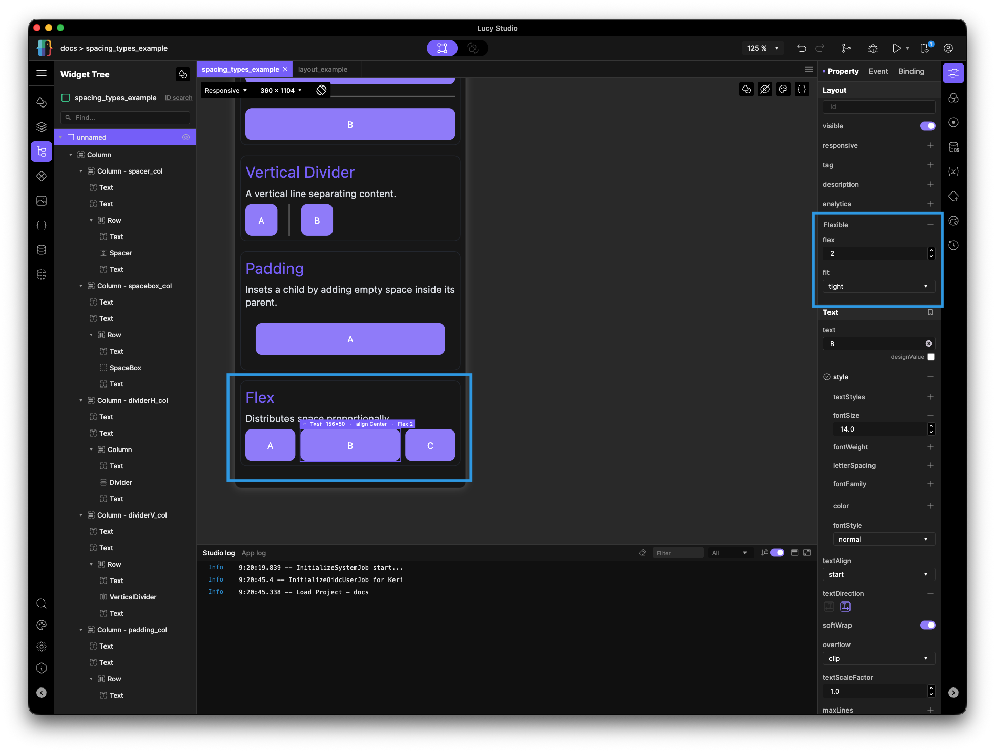
- Ex) In the image above, Child A and C have flex values of 1 and child B has a flex of 2. The sum of the children's flex values is four. Child B's flex value (2) divided by the total (4) is 0.5, or 50% — the amount of space child B will expand and fill.
-
Fit
-
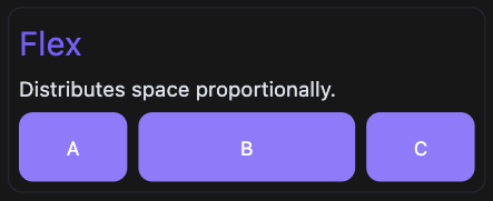
tight: the widget is forced to fill its entire allocated flex space, even if its natural size is smaller. All of the children in the image below have their fit properties set to tight, despite them all having an intrinsic width of 50.
-
loose: the widget sizes to its natural size, capped at its flex allocation. This is the default.
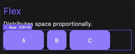
- Example: three children with flex: 1 each, all boxed at width 50, in a row with 328px of available width and 8px of spacing between children. Subtracting the two 8px gaps leaves 312px to divide among the children; split evenly three ways (flex: 1 each), that's 104px per child. Children A and C are tight, so each is forced to fill its full 104px share. Child B is loose, so it only uses as much of its 104px share as its natural width needs (50px), leaving the remaining 54px of its share unused.
-
-
Scrollable Overflow
When content goes beyond the bounds of a Row or Column, there are a couple of ways to handle this overflow by making the content Scrollable.
-
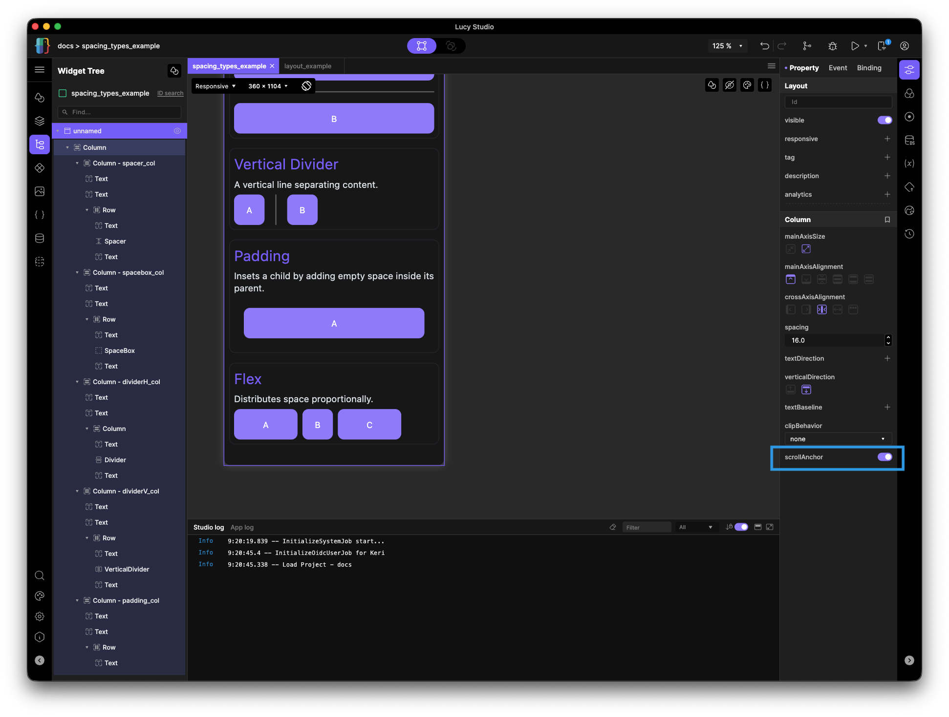
Use a ListView. If scrollable contents are all a different design, apply a ScrollView or enable 'scrollAnchor'.
-
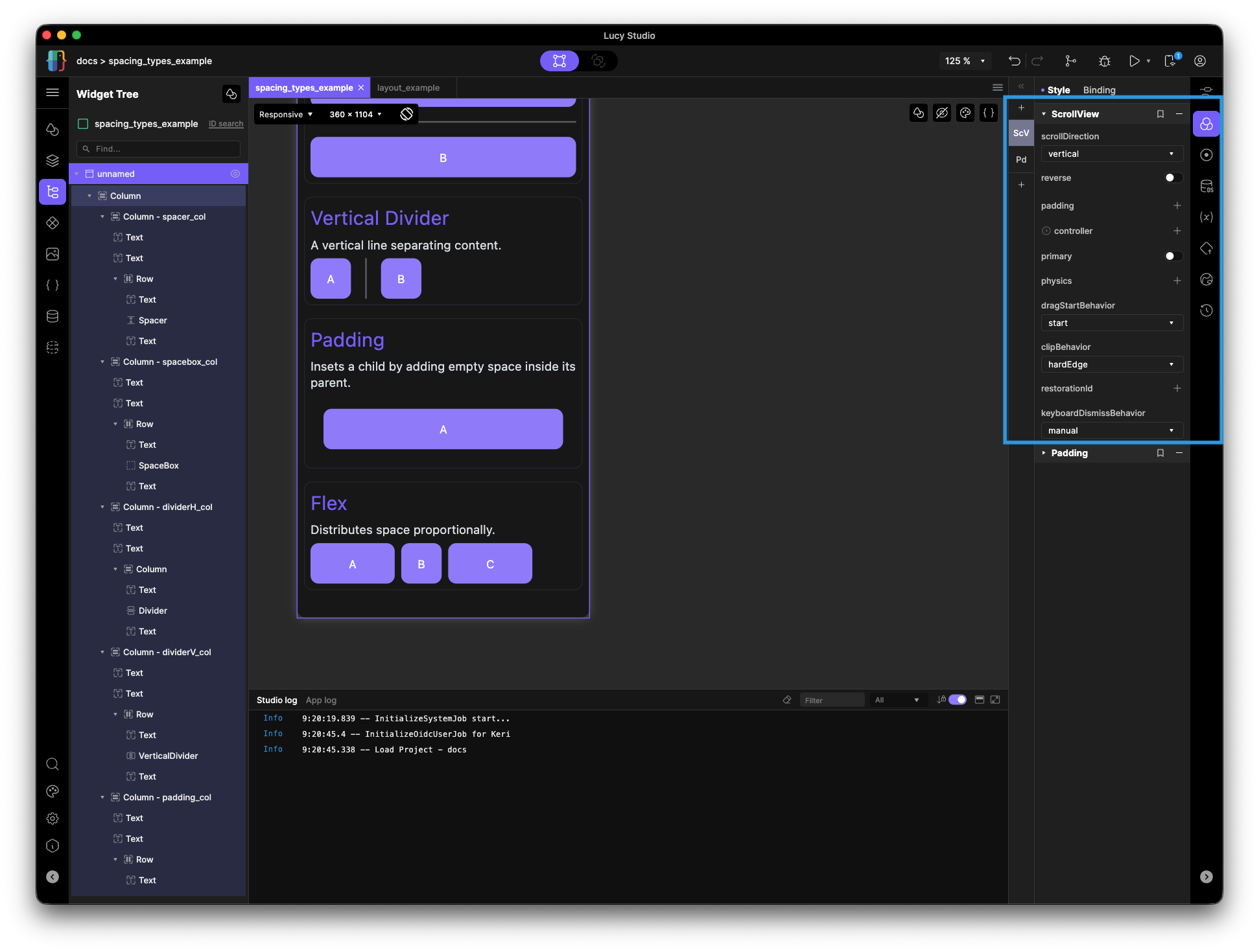
Add a ScrollView style to the Column or Row that holds the overflowing content.
-
Enable the 'scrollAnchor' property that comes with a Column.
-
Using this property also allows the user to scroll to a specific point of the column.
-
Scrolling to a specific point in the column is also possible. To learn more about how to do this, visit Column Widget Control.
-