Configure Color, Typography, and Icons
Lucy Studio lets you pre-register Color, Typography, and Icons as project-wide palettes/tokens, and each screen or component references them to apply styles. Instead of hardcoding values on every screen, managing them through a palette means that when your brand color or font changes later, updating it in one place propagates to every screen that references it.
Apply Typography (Semantic Font Styles)
Text styles for titles, body text, captions, and more are predefined as reusable sets that bundle font family, size, weight, line height, and letter spacing together.
More than 30 predefined styles are provided for different purposes (titles, body text, captions, etc.), and you choose the font family by name from a list.
Each text style is made up of 3 device types — Mobile, Tablet, and Desktop — so when you register a style you need to enter values for each type separately. This is because each device type (breakpoint) has a different viewport size, which calls for a different optimal font size.
Add a Custom Text Style
Besides the predefined presets, you can add a new text style directly from the Text Style theme editor using the [+Add Custom Text Style] action.
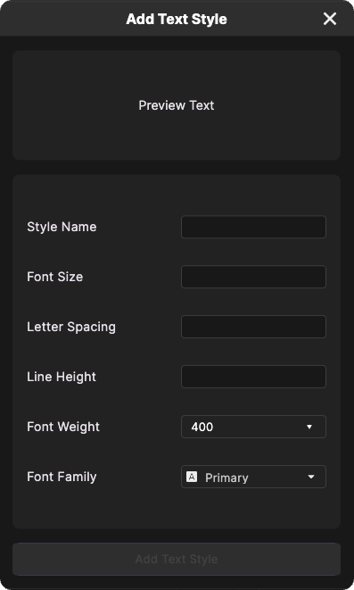
Enter the Style Name, Font Size, Letter Spacing, Line Height, Font Weight, and Font Family (dropdown) and save — it's registered as a custom style in the same registry as the presets (SemanticFontStyles).
Styles added this way are registered exactly like the built-in styles, so you can select and use them the same way on other screens.
Import Figma Text Styles
Using the "Import from Figma" feature in the Text Style editor, you can paste the text style JSON copied from the Figma plugin to import the parsed styles.
If you haven't installed Figma yet, go through Install Figma first. If you already have Figma installed but not the Lucy Studio plugin, see the "Install the Figma to LucyStudio Plugin" section in the same document.
STEP 1: Copy the text style from Figma
- In your Figma file, select the text style you want to import (a layer, or a text style preset).
- Run the installed plugin and click [</> Copy Code] to copy the selected text style to the clipboard as JSON.
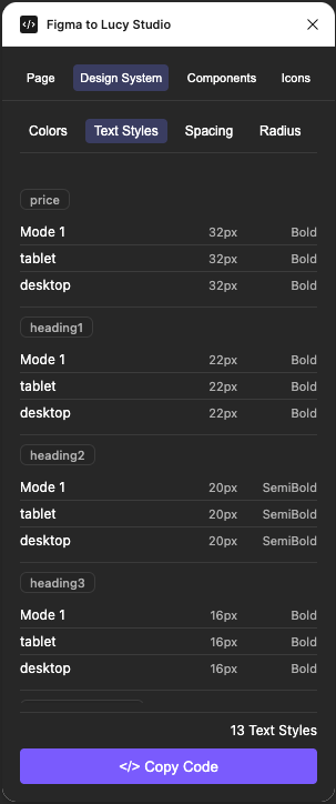
STEP 2: Paste it into Lucy Studio
- In Lucy Studio's Text Style editor, click the [Import from Figma] button.
- In the dialog that opens, paste (Paste, macOS: Cmd+V / Windows: Ctrl+V) the JSON you copied earlier.
- Click [Import] to apply it.
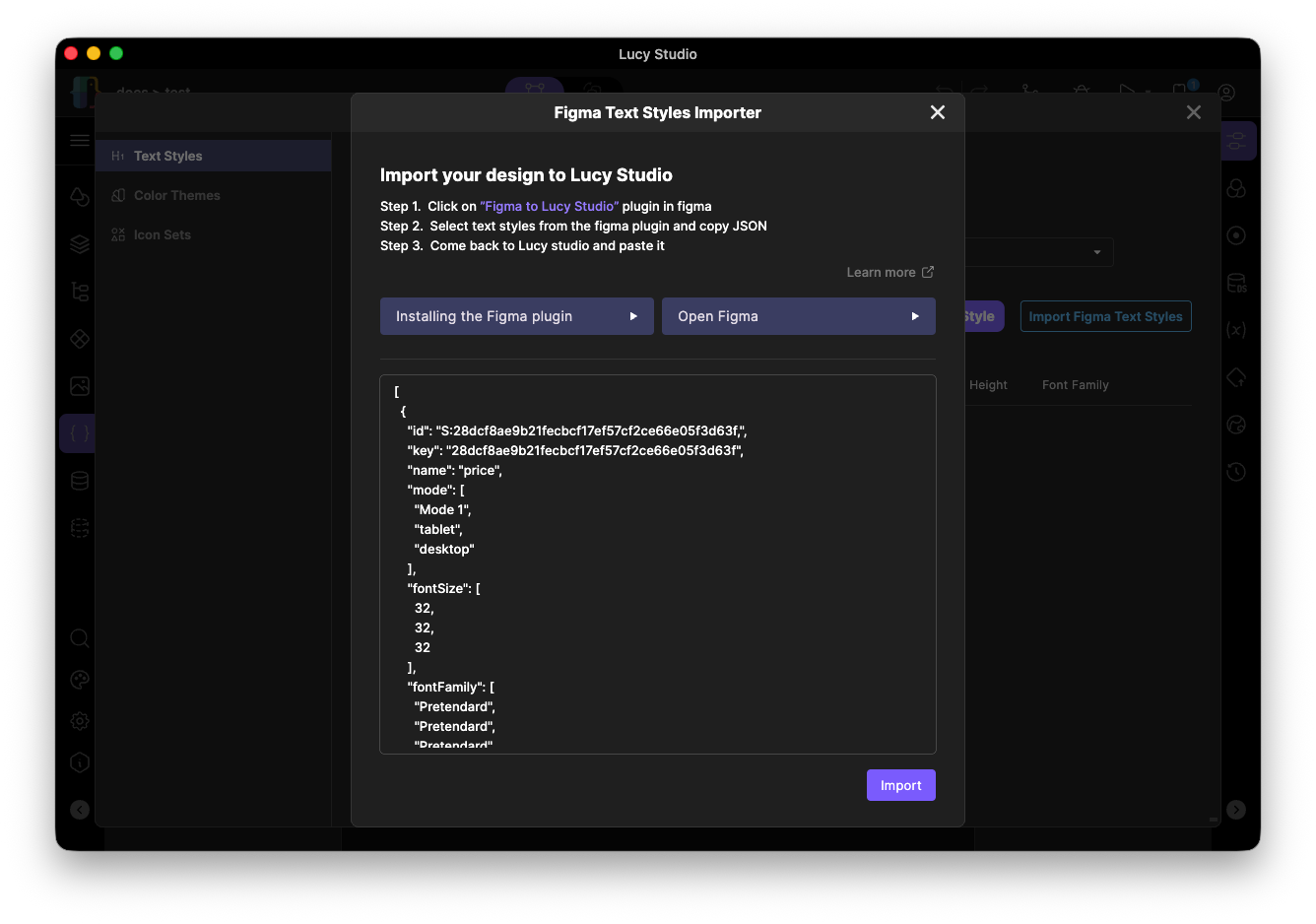
The imported style's values are automatically mapped per device type (Mobile/Tablet/Desktop). If the style was already imported before, it's updated; otherwise it's added as new. Styles imported this way can be used exactly like the built-in styles.
Color Palette (Semantic Colors)
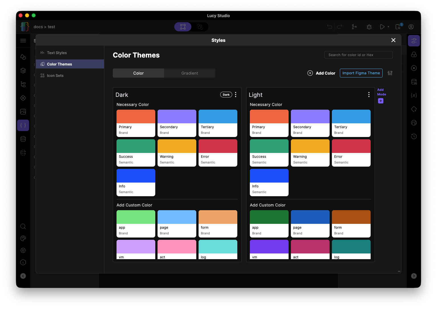
Instead of entering colors directly on every screen, you pick them from a pre-registered palette. Colors are organized into 16 groups, including primary colors, background/surface, border/line, text, and status indicators.
Add a Custom Color
Besides the predefined color palette, you can add a new color directly from the Color editor using the [+Add Color] action. Enter a color name and value (hex, etc.) and save it — it's registered as a custom color in the same registry as the presets (Semantic Colors).
Colors added this way are registered exactly like the built-in colors, so you can select and use them the same way on other screens.
Import Figma Colors
Using the "Import from Figma" feature in the Color editor, you can import color values defined as Figma Variables/Styles. Just like with Text Styles, paste the color JSON copied from the Figma plugin to register the parsed colors.
If you need to install Figma or the plugin, see Install Figma.
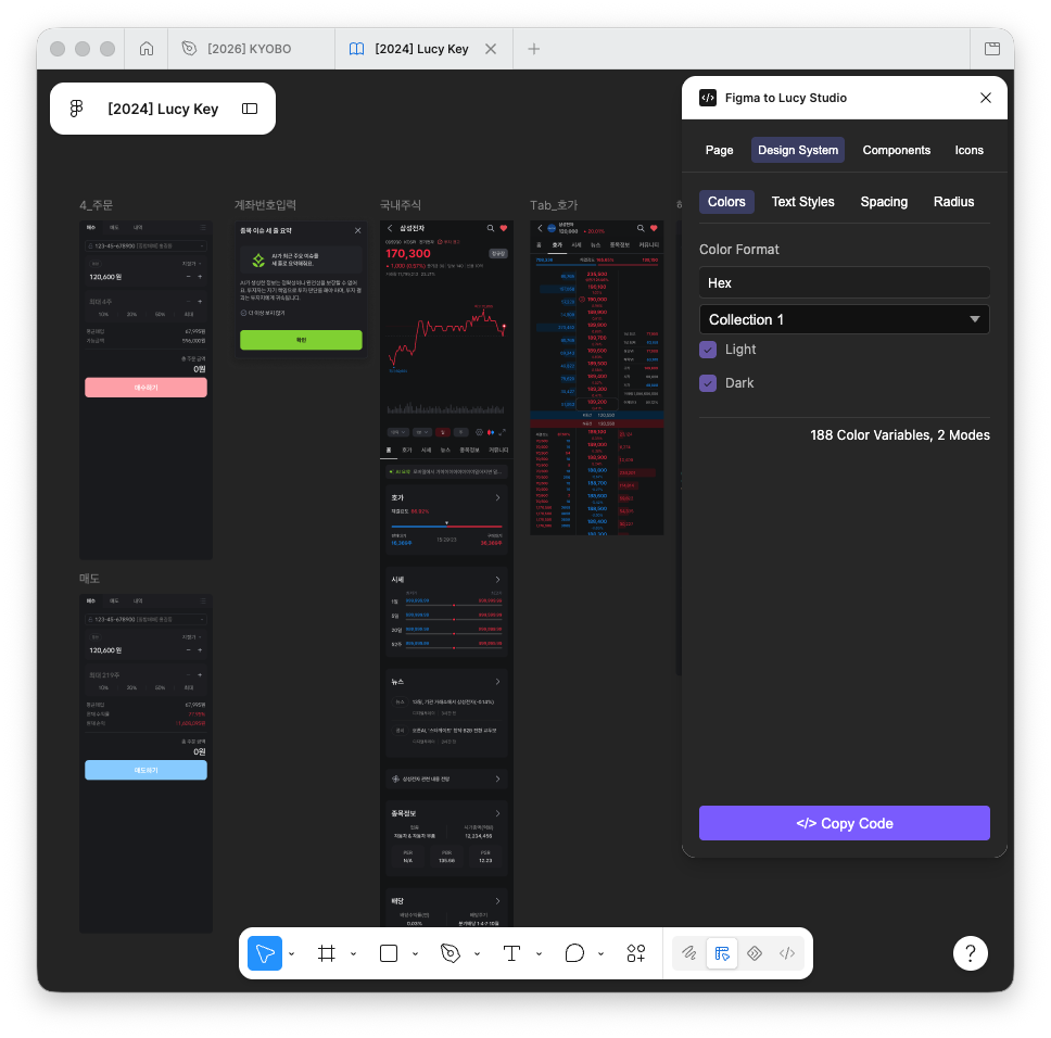
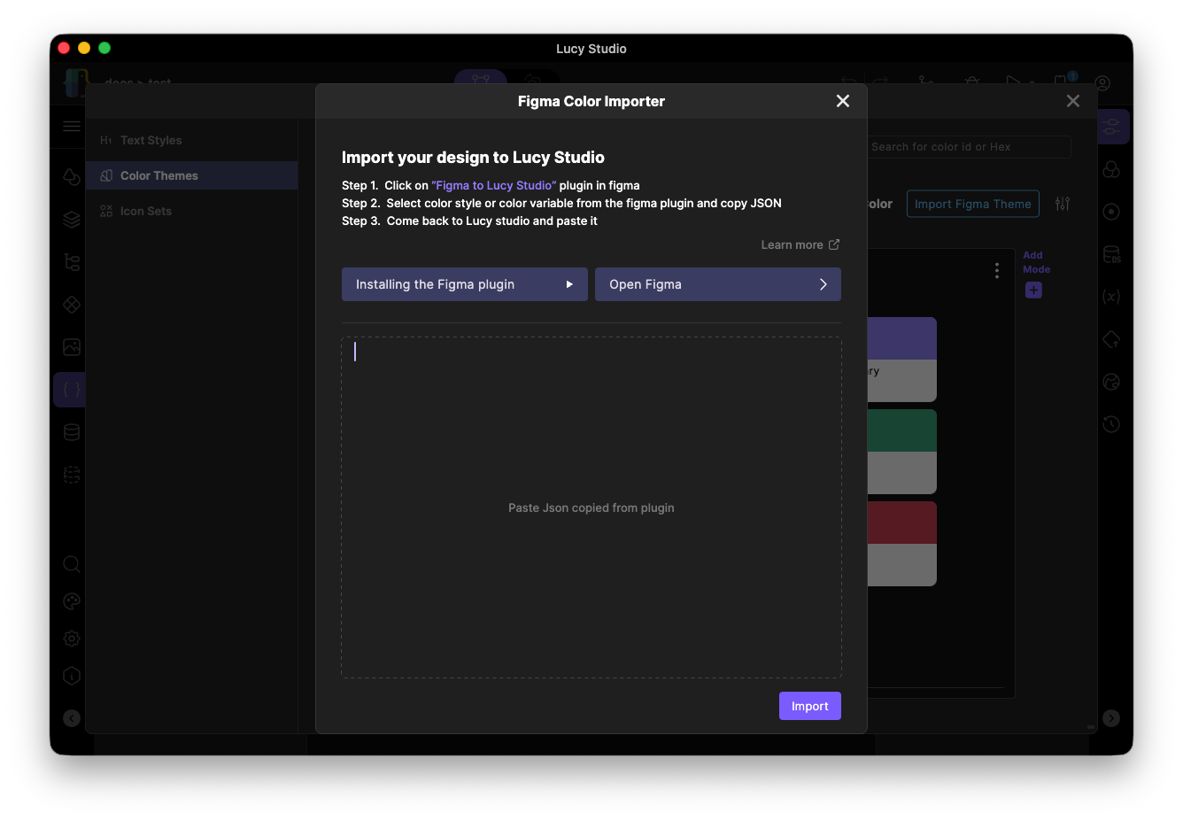
Imported colors that were already registered are updated; new ones are added. Colors imported this way can be used exactly like the built-in colors.
Icons
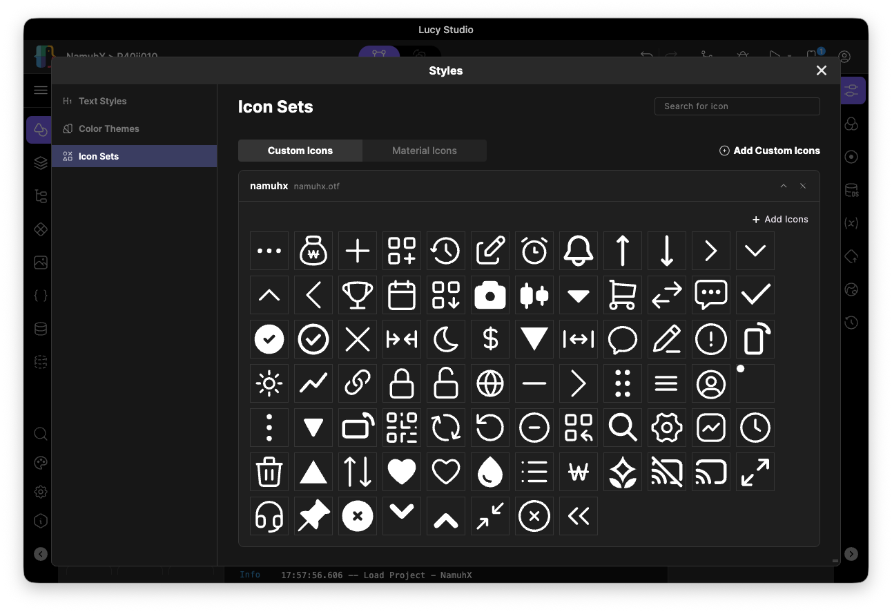
Icons can be used in two ways: the built-in Material Icons, and Custom Icons that you register yourself. When assigning an icon to a widget, you can pick from both types on a single selection screen.
Register Custom Icons
Gather SVG icons into a single icon set and register it, and it becomes selectable afterward from the Custom Icons tab on the icon selection screen.
- Create a new icon set and give it a name.
- Add SVG files to the set.
- Convert (generate) the added SVGs into a single icon set.
- Register the converted icon set to finish.
Registered custom icons support the same free sizing and coloring as Material Icons.
Use the Built-in Icon Library (Material Icons)
You can select and use Flutter's built-in Material Icons set as-is.
Notes
- Color/font/icon values only need to be changed in one place — the palette/token — to propagate to every screen that references them.
- On the icon selection screen, you can switch between the Material Icons and Custom Icons tabs to pick icons from either.