Panel
Panel is the right-side editor where you configure the selected widget in real time.
Edit visual properties, typography, events, animation, and data bindings directly from Panel.
Panel behavior changes by mode: Edit Mode and Animation Mode.
| Category | Edit Mode | Animation Mode |
|---|---|---|
| Primary goal | Define app structure, behavior, and data flow | Define interaction and visual motion |
| Core tabs | Property, Style, Data Set, Provider Instance, Variable | Action, Detect Transition, State Transition |
| Main role | Decide what widgets show and what data they use | Decide how widgets respond and animate |
Panel in Edit Mode
Edit Mode is the default mode for building app structure: layout, data connection, and variable management.
Panel includes five tabs in this mode: Property, Style, Data Set, Provider Instance, and Variable.

1. Property Tab
Configure core widget behavior.
- Set widget identity, visibility, position, and alignment.
- Configure widget-specific options for Page, Form, Row, Image, and others.
2. Style Tab
Configure visual design.
- Set background color, border, radius, and box shadow.
- Use transforms to adjust size, rotation, and position.
- Add gesture events such as tap and drag.
- Apply DecoratedBox for advanced background styling.
3. Data Set Tab
Define data structures to bind with widgets.
Data Set and Provider Instance
A Data Set stores structured UI-bound data. A Provider Instance is responsible for external data requests.
- Create custom data sets with
GroupandItemstructure. - Import structures from Provider Instance definitions.
- Bind widget fields using Content Data Set.
4. Provider Instance Tab
Configure communication with external APIs.
- Create instances from selected data providers.
- In Call, define request parameters and bindings.
- In Response, map response structure and extract required data.
5. Variable Tab
Create and manage runtime variables.
- Variable scope: Page Variable or Form Variable.
- Variable shape: Simple or Complex.
- Grid Variable: Variables specialized for grid-based widgets.
Panel in Animation Mode
Animation Mode is used to define interaction and transition behavior.
Panel includes three tabs in this mode: Action, Detect Transition, and State Transition.
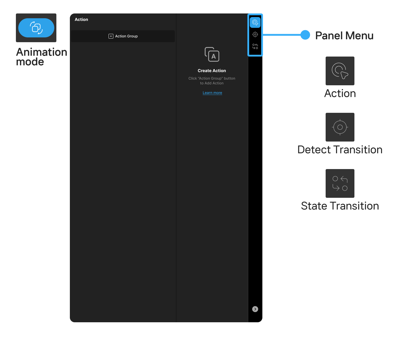
1. Action Tab
Define logic that runs in response to user events.
- Select an event and attach one or more actions.
- Run actions sequentially or in parallel.
- Add conditions for guarded execution.
2. Detect Transition Tab
Observe variable and control value changes, then run registered event responses automatically when conditions are met.
- Optimized for real-time state detection and automated reactions.
- Configure and revise conditions directly in the UI.
3. State Transition Tab
Define micro-interactions when widget state changes (for example button color change).
- Transition types
- Layout: Animate property values over an interval.
- Action: Trigger actions.
- Condition: Run a transition group when conditions are true.
- Link: Run linked transition groups.